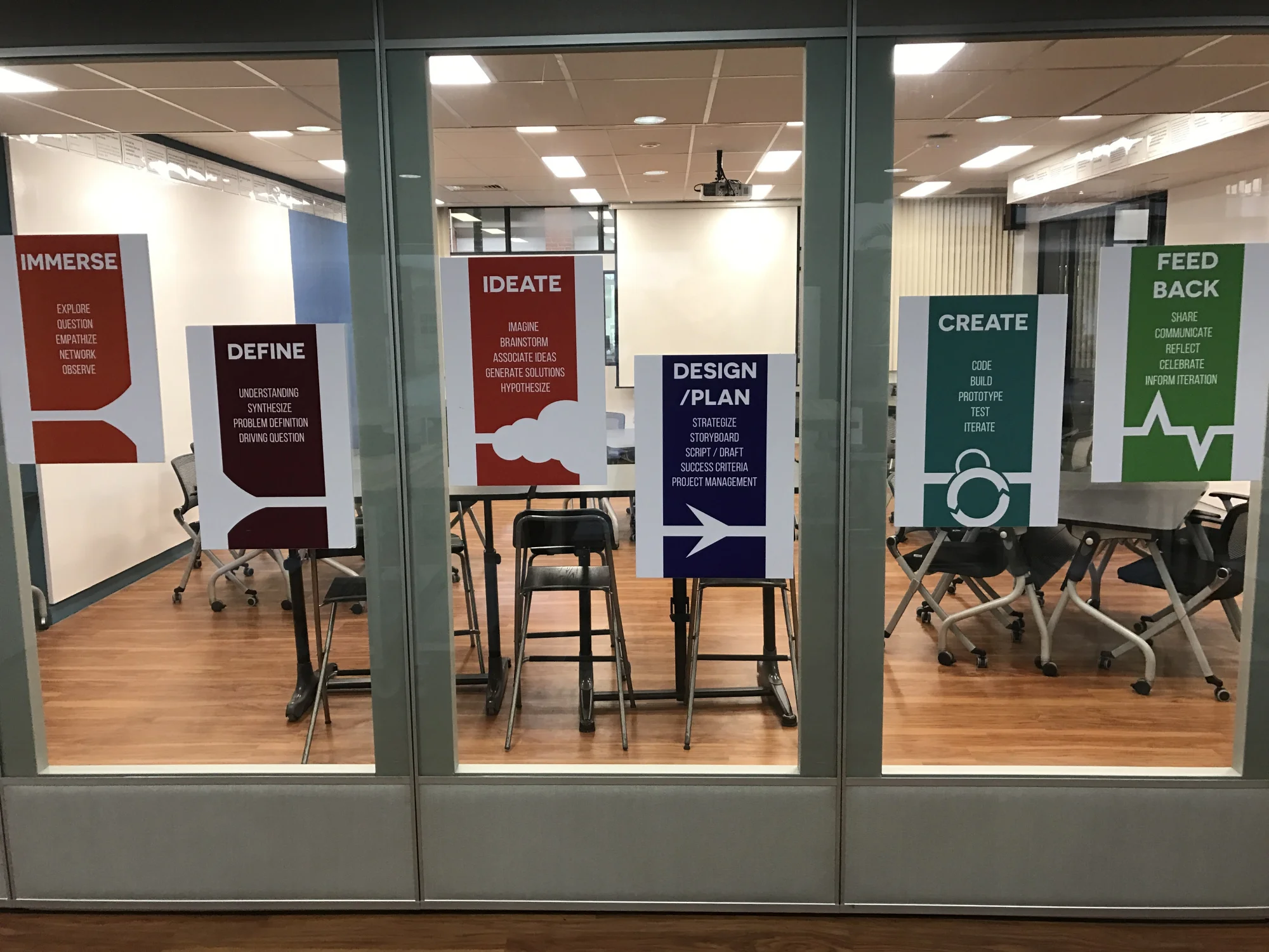
In my travels I’ve come across some inspiringly designed spaces that have several things in common. First, they all shift the design of the room from the teacher to the student. When you enter the space it’s at first difficult to ascertain where the focal point of the space should be. Second, they all utilize mobile and modular furniture. There are several different types of seating, working, and sharing spaces that can be configured in countless ways. Third, transparency is a key theme. Whether it’s natural light, accordion-style dividers, or glass walls, it’s abundantly clear that these rooms don’t want to promote a closed door mentality. And last, the tech is hard to see. All of the spaces possess tech tools from Chromebooks to iPads to flatscreen TVs to VR gadgets to 3D printers, but none of these items appear to drive learning in the space. Rather, all of these investments are located in areas and in ways that seem to suggest they support, enhance, and accelerate what is happening in the classroom.
Underlying all of these design changes, renovations and investments is the overwhelming shift they’re making from a teacher-centered classroom to a student-centered learning space.
What are your thoughts on these spaces and how they’re designed? What does your class look like? How can you make cost-effective and immediate alterations to your classroom to impact learning for your students? Leave a comment below!


